Categories
Harley Davidson is a name not unknown to anyone today, particularly for bike riders. Every rider or biker guy/ girl wishes to own Harley Davidson one day, but can everyone afford it? Now that’s one another story. However, how many of you have noticed this crazy band’s logo? The story behind it? Or how many times has it changed up till now? There is no denying to the fact that logos are the gateway to your brand; a lousy logo can just strip down your brand reputation. And for a brand like Harley Davidson, they cannot risk it.
Let’s educate you about this brand’s logo and see how it has evolved so much over time.
1) 1910- First Logo
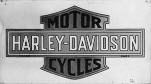
The Harley Davidson story is not merely a few years old stories, but it goes a long way back to 100 years, as it launched its first bike in 1903. However, the surprising fact is for almost seven years; the company did not really have any official logo; it was just an anonymous brand providing top-level bikes. Later in 1910, the brand’s creator came up with the official logo, which features an iconic handlebar and shield.
The logo stayed intact for four decades, which is a pretty long time, and served as the sole identity for the brand. Gradually, the brand took a pace and became famous worldwide for its quality and exhilarating feeling that it provides to the bikers.
2) 1953- V Logo
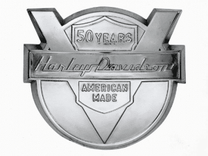
After four decades, there was a change in the customer’s preferences; a new generation entered into the market and wanted more from the company. Apparently, the first logo did not really serve the purpose well, which was the main identifying factor for almost four decades. Nevertheless, the creative directors were then made to be a little more creative and create a new logo.
Therefore, in 1953, while celebrating its half-century, the brand introduced a new characteristic V in their logo. The “V” in the Harley Davidson logo made it more detailed and attractive for the upcoming generation. Later the years, the organization started featuring V on the rondure that fitted on all their latest models. The new generation embraced the logo and appreciated the brand for introducing the V factor in their logo.
3) 1965- Classic logo
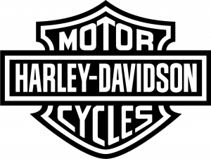
Ten years later, the brand decided to facelift the logo, which stayed with the brand for the longest time. The classic logo introduced in 1965 has been the most liked logo of Harley Davidson. However, if you give your eagle’s eye to this logo, you would see there is not an enormous difference between the 1910 and 1965 logos.
The forms and elements of the 1910 logo remained pretty the same in 1965’s logo, too; however, the edge’s sharpness was minimized, and the designers gave it a more uniform color. 1965 was the year when the designers introduced more flexibility in the logo, and the company let their dealers devise a separate logo for the fleet.
4) 2003- Bar and Shield logo
The brand is hundred years old; it calls for a celebration.. no? Apart from other well-deserved celebratory events, Harley Davidson went out of their way and celebrated their century by introducing a bar and shield logo for their brand. The logo clearly shows the two significant years marked that was the prominent landmark for the company i-e, 1903 when the company came into being and 2003 a hundred year to the company.
The new logo showed off the same classic logo and the brand name on it; however, it gave it less prominence in the overall design. The bar and shield logo was horizontally expanded along with the pair of wings beneath the handlebar.
Interested in knowing the meaning behind this logo? Well, the wings show the spirit of independence and freedom that one feels when he/ she is on bike riding to their destination. The wings and the bar and shield attracted people more towards the brand, and they started associating themselves more with it. As if the brand was speaking to them through its logo.
5) 2008- The current logo
This was the year the brand celebrated its 105th anniversary; a long time, huh? The company celebrated it by changing their logo a little there were not many alterations done on it. The emblem had all the elements of 2003 but redesigned it to fit into the modern world. Since the world was changing, the customer’s preferences were continually shifting, so the brand gave its logo a slight contemporary touch. The current logo is quite appealing to the new generation mood that looks for a different kind of brand association.
Again, the main characteristics remained the same, but the designers created a circular design and caged all the other logo elements into them. The shield showing the organization’s name was brought closer to the center, whereas the wings from both sides of the shield curved to the upper side rather than the outer side.
The logo features the most prominent years for Harley Davidson until now, which are 1903 and 2008, while representing 150 years on the top, engulfed by the wings on both sides. This is the logo that is still in practice after circulating for a year!
6) 1983- HOG Logo
HOG stands for Harley Davidson Group, a fan club for all kinds of HD lovers with various international chapters. While all the logos explained above are particularly for Harley Davidson’s official company, the HOG logo was designed in 1983 for a particular group of owners.
The logo shows a banner in the lower part with a bald eagle hovering over a wheel in the middle and showing the initial of Harley Group (HG) in the center.
So which ones your favorite logo?
