
Author
Categories
Logo design is one important part of the branding of any kind of business you are working in. Your business logo is the marketing tool that attracts the most attention towards your business and allows you to build a strong and solid loyal customer. A clear and direct message is sent through the business logo therefore it is recommended to ensure all your logo design practicalities are done right.
In the current competitive business world, a business logo plays a drastic role in enhancing your target market reach. It targets both your consumer and the market. It shows that all the colors of elements and designs must send the right message of the brand to the audience. There are various custom logo design services available out there to help you design the right message for your brand.
Think of two very famous brands Nike Swoosh and Crocodile of Lacoste, you would just see these symbols and would remember the brand right in your head. Anybody can recognize them from afar or nearby. It is generally believed that the logo design should be simple and easy to understand however this is not always the case. Sometimes complex and difficult logos get into the head of the customer and stay there. Nevertheless, the purpose of both the complex and the easy logo is to convey the message right to the customers. When my brand needed a logo and I wanted someone to make me a logo I relied on these logo design service agencies and it was the best decision that I took for my brand.
People often get confused about whether they should go for the complex logo or a simple logo, here is a difference that would help you make the decision.
1) Simple and Easy to Understand Logo
Imagine yourself going to the mall where there are hundreds of brands right in front of you. The one thing that would confuse you the most is to recognize them. Amidst hundreds of logos and brands available there, standing your brand out of the crowd is one important aspect of the brand identity. Your logo can come pretty handy in this case, if you know how to create a logo that is both attractive and meaningful. Everybody today is following the mantra of “less is more” and that is what is getting them (the brands) the most attention.
Most of the well-known brands and companies have simple logos. The graphic designers are taking it easy now and making logos that have greater meaning but lesser designing and coloring. The grading of the logos is something that the designers work on the most because every color indicates something and sends over the message to the audience. Not only the logos, but even the website designs of most of the organizations are pretty clean and simple now.
a) Nike and Apple
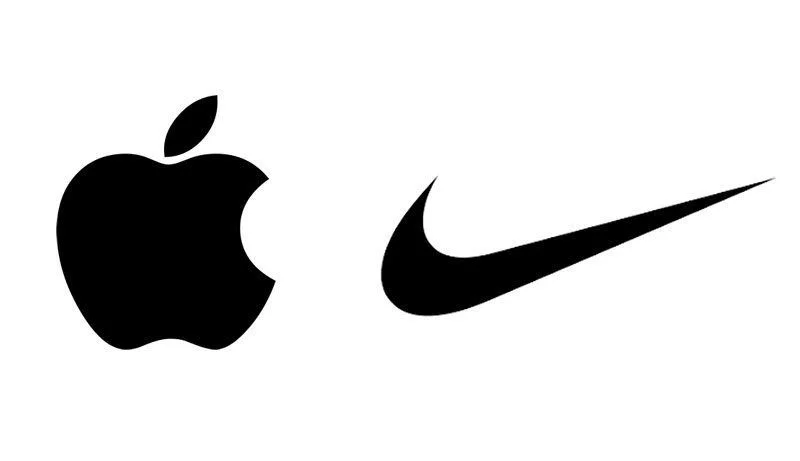
The logos of Nike and Apple are pretty simple and easy to remember, the Apple logo is simply the bitten apple. On the other hand, Nike has a swoosh sign only. You and I both can instantly recognize these logos even if we do not follow these products religiously or buy from them. It is mainly because they are extremely simple and are hammered so much that they are etched into our minds. One of the aspects of these companies’ logos is their instant brand recognition which helps them remember the logos. People remember these logos mainly because of the color scheme used in them. For example, the big yellow M is one reason why we remember McDonald’s so very much.
b) Advantage of Simple Logos
One of the many advantages of a simple logo is that they are easily and widely accepted all over the world. There are no difficulties and hurdles seen in these logos which include the problems of language, culture, nationality as they do not become a barrier in remembering the logos. You may not be aware of the English language but you would know it when you see Apple or McDonald’s or Nike’s logo. Mainly because these are the symbols that are remembered and understood universally. It means when your logo has a simple yet creative design and sends the right message across it stays in the customer’s mind and does it work effectively.
c) Negative Impact
When there are some pros there ought to have some cons as well. Sometimes, when the logo is too simple its meaning is opposite and pretty complex to understand. It is mainly because no slogans and text are incorporated in the logo which makes it even more difficult to understand. Leaving for the people to guess the product or do the homework while they are looking at your logo is something that is not recommended for the brand. Therefore, it is better to create a logo that is both simple and has clear meaning, you need to make the job easier for your audience not difficult.
2) Complex and Difficult Logos
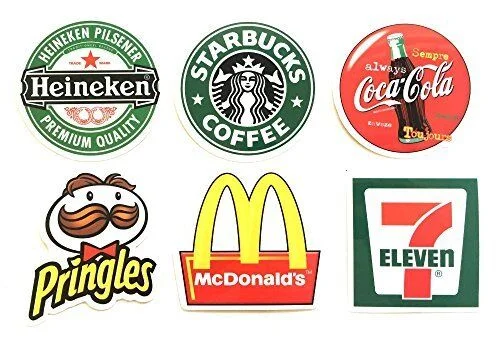
Having complex logos does not mean they are not easy to understand and you would have to struggle to remember them when you spot them on the road. We all remember Starbucks logos and recognize them instantly when we spot them on the road, the logo is difficult a little tricky for our minds but does not mean they are unrememberable. The famous complex logo brands include Heineken, Pirate Bay Coffee, Philadelphia Eagles, and Fuddruckers. The designs of these logos are not easy to understand but they have the capability of being the remembrance or staying in the mind.
The fonts and colors that are involved in these logos deliver the right message to the audience and make sure they are clearly understood about the brand purpose and what they are supposed to do. The logo is the perfect mixture of the different fonts, colors, and everything that one has to see in the logo. They do give fancy look and stand out among the other logos but yes, the design and everything about them is a bit on the complicated side.
The complex logos are not really on the faulty side. The main idea behind creating such logos is to make them stand out in the market. A design that has a lot of odd elements such as brochure design, logos, identity, and graphics is something that makes a logo different.
a) Starbucks Logo
The logo of Starbuck has a girl standing in the middle with the hands of a fish along with her wavy hair. She also has a crown on her head with different elements on it. All these things together make a complicated design. However, the point is even the complicated designs are easy to remember if designed rightly and correctly.
![]()
b) Advantages of Complex Designs
The complex designs give you the room to add more information even in a limited space. The type of information could be anything be in the text form or in the image form. Your text can convey a whole lot of information if done right. The text on the logo can tell the name of the brand whereas the image can tell business purpose. Take the example of the Heineken Beer logo, the logo does not only have the brand name but has Premium Beer (their USP) written on it too. The audience knows when they pay for it, they are paying for expensive and premium beer.
c) Disadvantages of Complex Design
When the design is complex there are very few chances of them having a great design. There are a plethora of logos with complex yet attractive designs but not many of them can do that. Therefore, it is widely advisable to go easy on the designs and create something that is simpler and yes again easy- to grasp.
Wrapping up
Now the question arises what should the brand go for? The ones that are looking to rebrand themselves or get a new logo altogether, whether they should go for the simpler ones or the complex logos? Nobody can make that decision for you; you have to make sure you know what you want from your brand and the logo. The simple logo VS complicated logo debate can go on and on and on with no final conclusion until you know what you want from your brand and logo.
However, one thing that matters the most, in this case, is that your logo should be unique, attractive, creative, and most importantly relatable. Those who look at your logo, should be impressed by it and want to study it more. Such logos can create a strong and loyal customer base which is basically the purpose of every brand out there. We all can agree to the fact that a good logo can create a long-lasting impact on the audience and lends quite a desired recognition.