

Use a responsive layout that adapts to smaller screens, readable text, usable navigation, and forms that work comfortably on a phone. Resize images and prevent important content from being clipped or covered. Test the actual enquiry, booking, or buying journey on real devices as well as in a browser preview.
Google's responsive design guidance covers adaptable layouts. MDN's viewport documentation explains mobile page sizing, while W3C's reflow guidance explains keeping content usable as the viewing area changes.
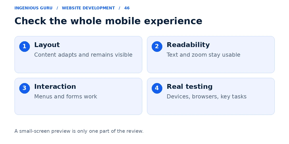
Fix the layout before shrinking the text
Let columns stack and components resize when there is not enough space. Avoid fixed-width sections that force ordinary content beyond the screen. Check long words, menus, tables, and embedded widgets because they can create horizontal overflow.
Have a developer confirm the viewport configuration and flexible layout rules. Making a desktop page smaller can leave the text unreadable and the buttons difficult to use.
Make the important content easy to use
Keep headings and paragraphs readable, use adequate spacing, and make links distinguishable. Put essential service information before decorative elements. The mobile version should retain the information a customer needs to decide.
Allow people to zoom. Check that text remains usable when enlarged and that sticky bars, cookie notices, or chat widgets do not cover navigation and form controls.
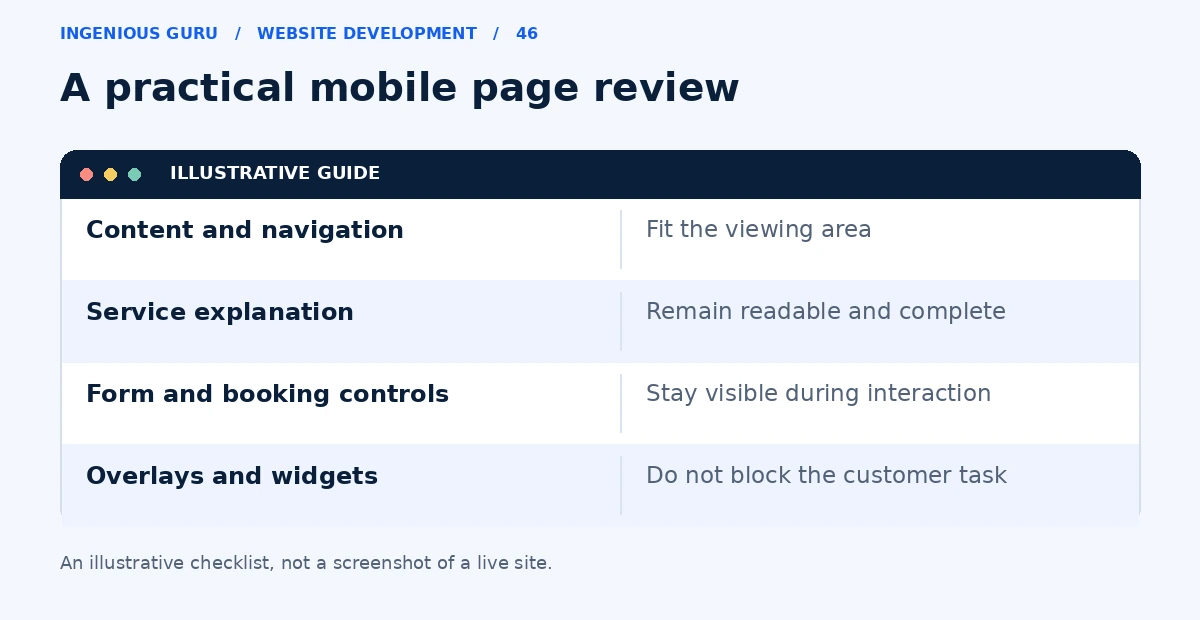
Test navigation and forms as complete tasks
Open the menu, choose a service, start an enquiry, correct an error, and submit it. Check that keyboard input does not hide the current field or the submit button. Use appropriate input types and labels so the form is understandable.
Make phone and booking actions easy to find without filling the screen with competing floating buttons. Read the conversion guide when deciding the primary action.
Keep the mobile experience reasonably fast
Send appropriately sized images and review large videos, animations, and unnecessary scripts. A layout may look correct but still feel difficult to use on a slower connection.
Use the website speed guide to investigate performance. Preserve a useful, stable layout while reducing the resources needed to display it.
Check more than one screen and browser
Browser resizing helps reveal layout problems, but it does not reproduce every real device behavior. Test available iPhone and Android devices, portrait and landscape views, and a slower connection where practical.
Record the page, device, browser, action, and problem so the fix is reproducible. Include booking and chat widgets, because their mobile behavior can differ from the rest of the site.
Mobile checks that matter to customers
- Ordinary content fits without horizontal scrolling
- Text is readable and zoom remains available
- Menus and controls can be operated comfortably
- Forms and bookings complete successfully
- Overlays do not cover important content or actions
A practical first step: Use your phone to visit an important service page and submit a test enquiry. Record every point where the task becomes confusing or difficult.
Ingenious Guru's development team can help investigate layout and interaction problems on your existing website. Send the URL and any device-specific issue to discuss improvements.